这条 prompt 详细描述了如何制作一个高质量的概念排版海报,特别适合中文营销场景中的品牌宣传、艺术展览或高端产品推广。
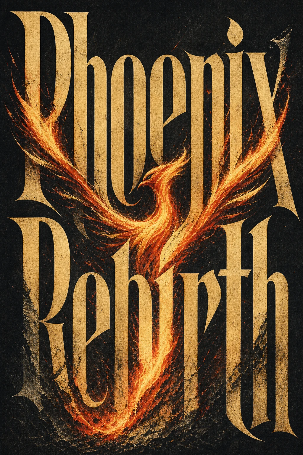
中文 Prompt
为确切的标题“凤凰涅槃”创建一个完成的高级概念排版海报。仅需一张海报,不需要情绪板、网格、展示板、模型、字幕、提示文本、过程表或样本标签。标题“凤凰涅槃”必须是海报的主要视觉结构:巨大、可读、有力且拼写准确。不要翻译、缩短、替换或拼错它。不要添加其他大的可读文本。只有在保持微妙和次要的情况下,允许使用微小的目录文本。默默认知标题的意义、氛围、文化气息、象征关联、心理张力和视觉节奏,并将其转化为一个强有力的视觉隐喻。排版是核心。设计看起来定制的字母形式,其重量、宽度、对比度、间距、节奏、变形、负空间、边缘质量和油墨纹理表达标题的气质。字体应该感觉是有意设计的,而不是像默认字体。如果“凤凰涅槃”指的是一个广为人知的人物,那么让一个大型编辑肖像或全身/半身人物成为主要的视觉存在,占据大约40-70%的构图。人物应该通过氛围、姿势、造型、时代、表情、照明和象征性氛围而感到可识别,但不应复制特定的现有照片、官方海报、活动图像、标志、标语或受版权保护的构图。肖像必须与排版互动:重叠字母、从字母中浮现、被字母框住、在字母上投下阴影、突破字母或部分隐藏在字母后面。对于所有其他标题,仅当增强意义时才使用人物、风景、物体或氛围设置。它必须与排版互动并深化概念,而不是装饰它。使用丰富但克制的4-6色系统匹配主题:主导背景色、主要排版颜色、人物/风景色调、情感强调色、柔和支持色和微妙纸张/油墨纹理色调。除非概念上有必要,否则避免使用平庸的黑白红默认配色。构图风格:高端编辑海报、博物馆级平面设计、戏剧性比例、强烈层次、少量元素、智能空白、大胆的纯色区域、锐利裁剪、丝网印刷/石版画/凸版印刷颗粒、纸纤维、微妙的油墨瑕疵、精致的视觉张力。最终图像应该像一个完整的视觉句子:标题、人物或环境、颜色和排版相互解释。
查看英文原 Prompt(保味自跑用)
Create ONE finished premium conceptual typography poster for the exact title:

“[INPUT_TEXT]”

Single poster only. No moodboard, grid, presentation board, mockup, captions, prompt text, process sheet, or sample labels.

The title “[INPUT_TEXT]” must be the dominant visual structure of the poster: huge, readable, powerful, and spelled exactly. Do not translate, shorten, replace, or misspell it. Do not add other large readable text. Optional micro catalog text is allowed only if it stays subtle and secondary.

Silently interpret the title’s meaning, mood, cultural aura, symbolic associations, psychological tension, and visual rhythm. Turn that interpretation into one strong visual metaphor.

Typography is the hero. Design custom-looking letterforms whose weight, width, contrast, spacing, rhythm, distortion, negative space, edge quality, and ink texture express the temperament of the title. The type should feel intentionally designed, not like a default font.

If “[INPUT_TEXT]” refers to a widely known person, make a large editorial portrait or full / half-body figure a major visual presence, occupying roughly 40–70% of the composition. The figure should feel recognizable through aura, posture, styling, era, expression, lighting, and symbolic atmosphere, but should not copy a specific existing photograph, official poster, campaign image, logo, slogan, or copyrighted composition. The portrait must interact with the typography: overlapping the letters, emerging from them, being framed by them, casting shadows on them, breaking through them, or being partially hidden behind them.

For all other titles, use a human figure, landscape, object, or atmospheric setting only when it strengthens the meaning. It must interact with the typography and deepen the concept, not decorate it.

Use a rich but restrained 4–6 color system matched to the theme: dominant background color, primary typography color, figure / landscape tone, emotional accent color, muted support color, and subtle paper / ink texture tone. Avoid flat black-white-red defaults unless conceptually necessary.

Composition style: high-end editorial poster, museum-quality graphic design, dramatic scale, strong hierarchy, few elements, intelligent whitespace, bold flat color areas, sharp cropping, silkscreen / lithograph / risograph grain, paper fibers, subtle ink imperfections, refined visual tension.

The final image should feel like a complete visual sentence: the title, the figure or setting, the color, and the typography explain each other.

Avoid generic word art, glossy 3D lettering, random icons, stock-photo realism, cluttered collage, excessive grunge, tourist clichés, official logos, copied slogans, copied campaign aesthetics, unrelated text, and misspelled typography.

-----

INPUT_TEXT:Phoenix Rebirth
想用这个 Prompt 自己生成一张?
查看生成方法懒得抄 prompt?这些填空模板直接用
全部 3 个 →把 {变量} 换成你的产品 / 文案,复制即用,无需懂 prompt 工程。